© 2024 Alisha Bourne
Role: Designer, Researcher
Duration: 2 Weeks
Output: Redesign
Background
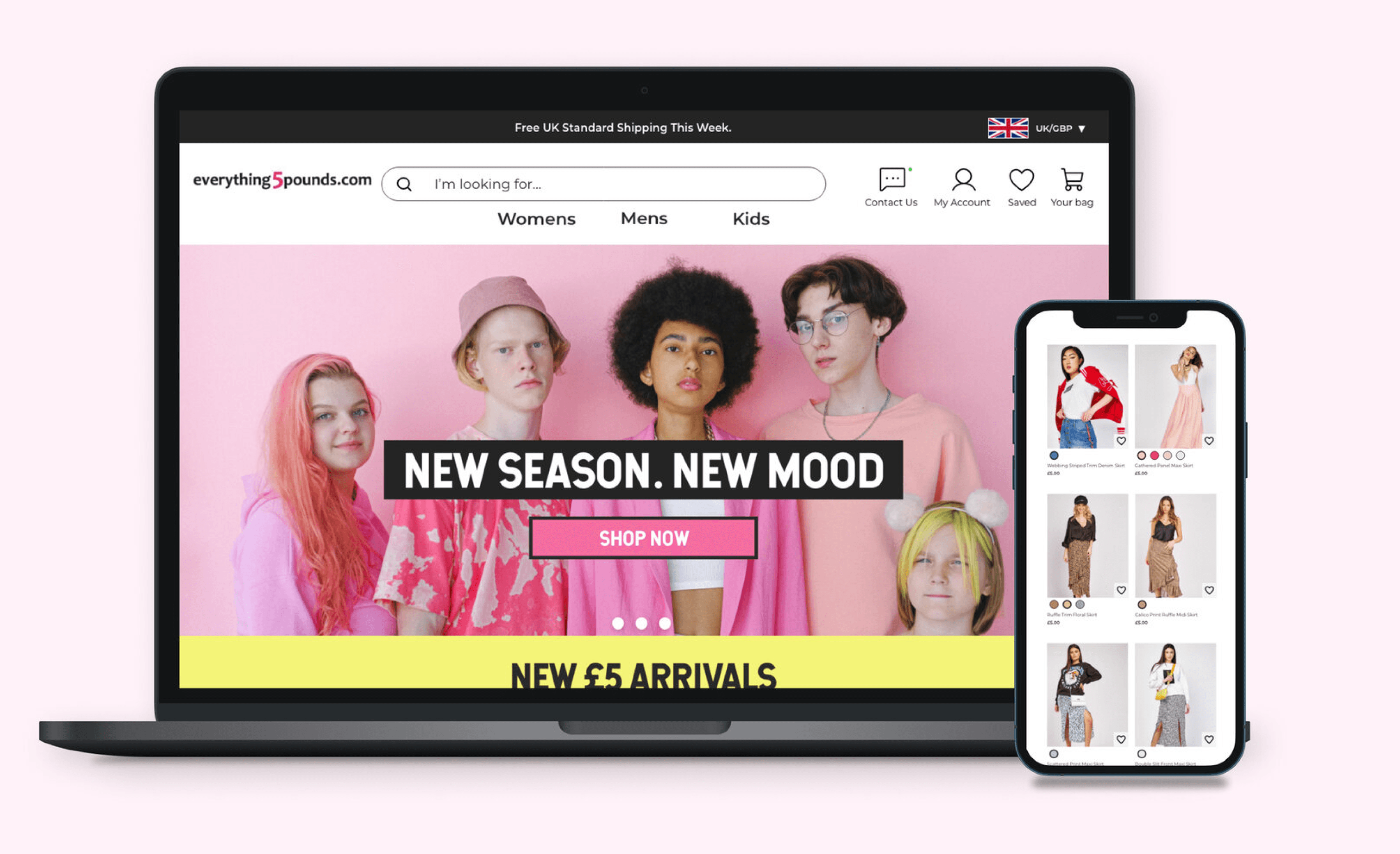
The rise of technology and the internet has fuelled the boom of e-commerce, providing customers with a convenient and accessible shopping experience from their personal devices. The COVID-19 pandemic and its restrictions further accelerated the adoption of e-commerce, as non-essential businesses were forced to close their physical stores and adapt to online operations to survive. This shift has empowered customers with more choices, control, and a seamless journey, compelling companies to integrate e-commerce into their business strategies to meet the evolving consumer demands.
Everything5pounds is a British fashion e-commerce website founded in 2010, offering affordable womenswear, menswear, kidswear, and plus-size clothing. With a global user base of one million, the company prides itself on its "Staged Fashion" and "Reasonable Pricing Policy," catering to customers seeking stylish and budget-friendly clothing options.
DISCOVER
WEBSITE ANALYSIS
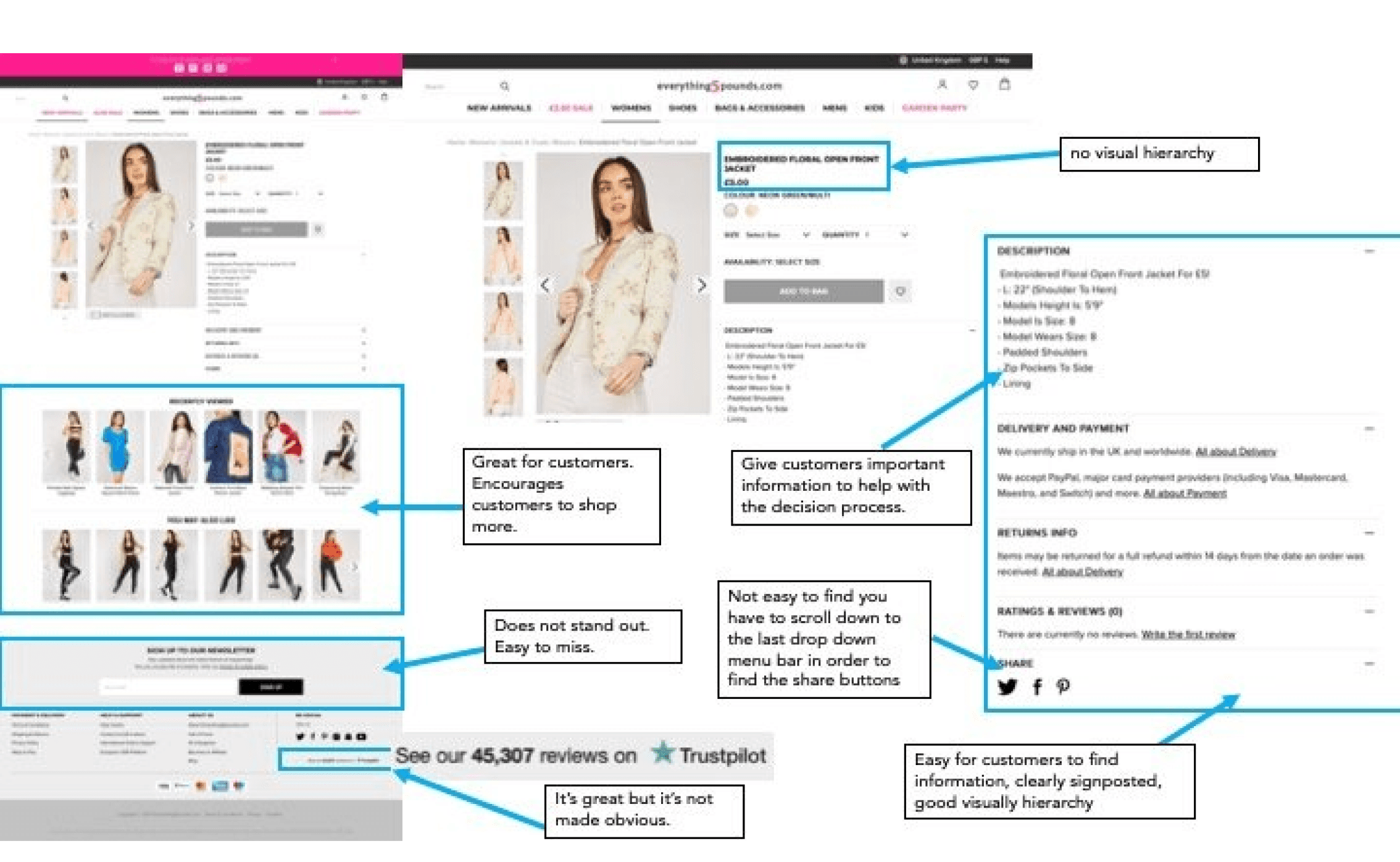
In order to get some more information, I decided to do an analysis of the current website. In the audit I looked at what they done well and what they didn't do well in. For this analysis, I looked at the website on both desktop and mobile. I came across some issues which range from not having a sizing guide to not following WCAG guidelines.
Overall, I found the website simple to use but I came across quite a few inconsistencies and design/careless mistakes which could potentially be seen as negative to potential customers.
Heuristic Analysis
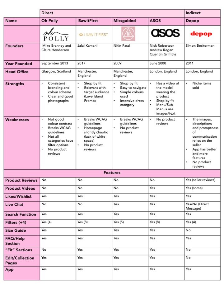
Conducting a heuristic analysis is crucial to gain insights into the market dynamics, competitors' strengths and weaknesses, and potential gaps. For this analysis, I will focus on both online direct and direct British competitors, ensuring a comprehensive evaluation. The competitors were strategically selected through online searches for "online fashion shops" and discussions with industry professionals and target audience members. This analysis will provide valuable data to identify opportunities, differentiate the brand, and craft a compelling user experience that addresses the evolving needs and preferences of the target market.
Similarities
All competitors had a filtering system of 4+ criteria which allowed customers to be specific in their searches.
All competitors had multiple images of the item and all had a size guide and stated the height/weight of the model.
Differences
Other than obvious design differences, ASOS were the only competitor to have videos of some of the products.*
Out of all the competitors, ASOS and Missguided were the only companies to have a live chat function
User Research: Surveys
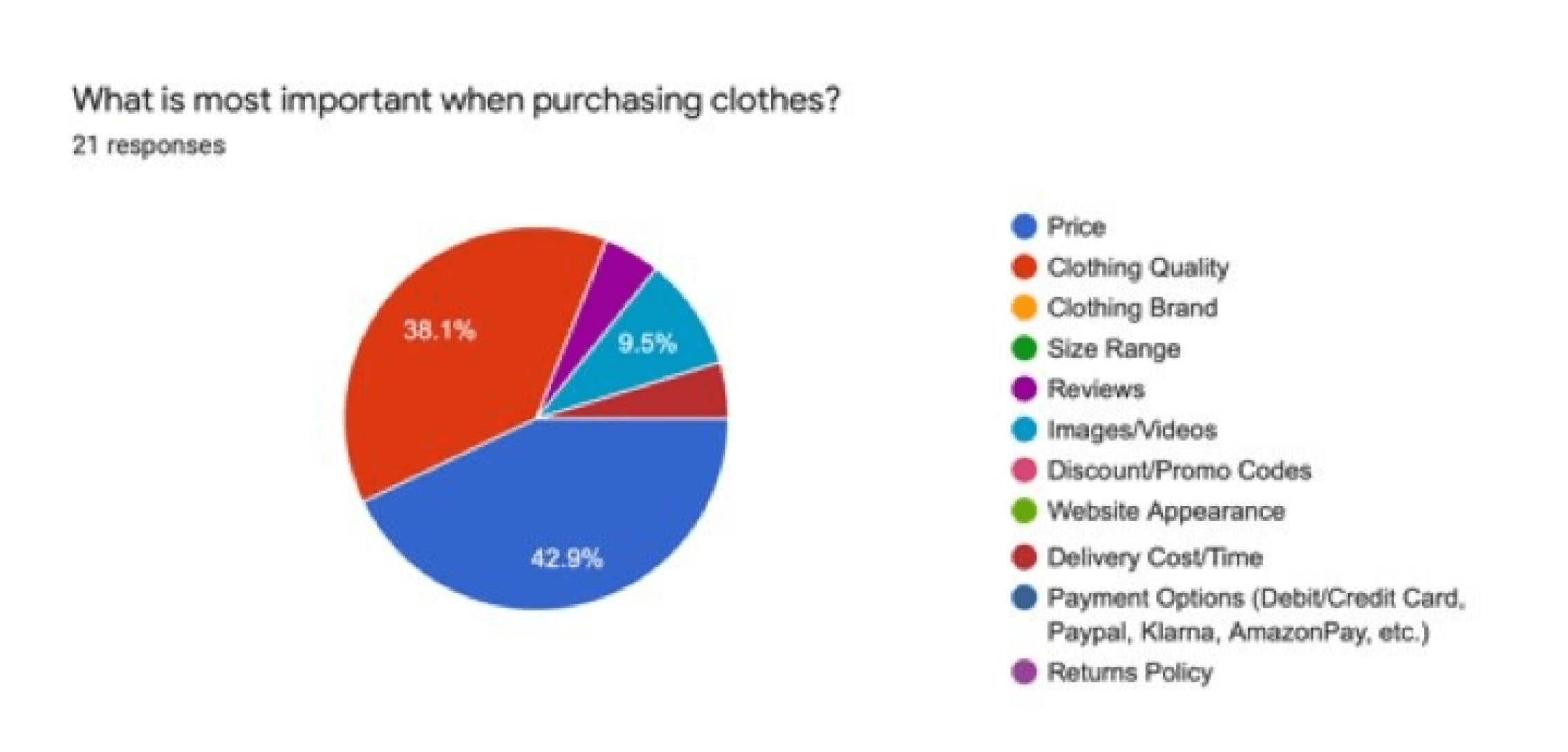
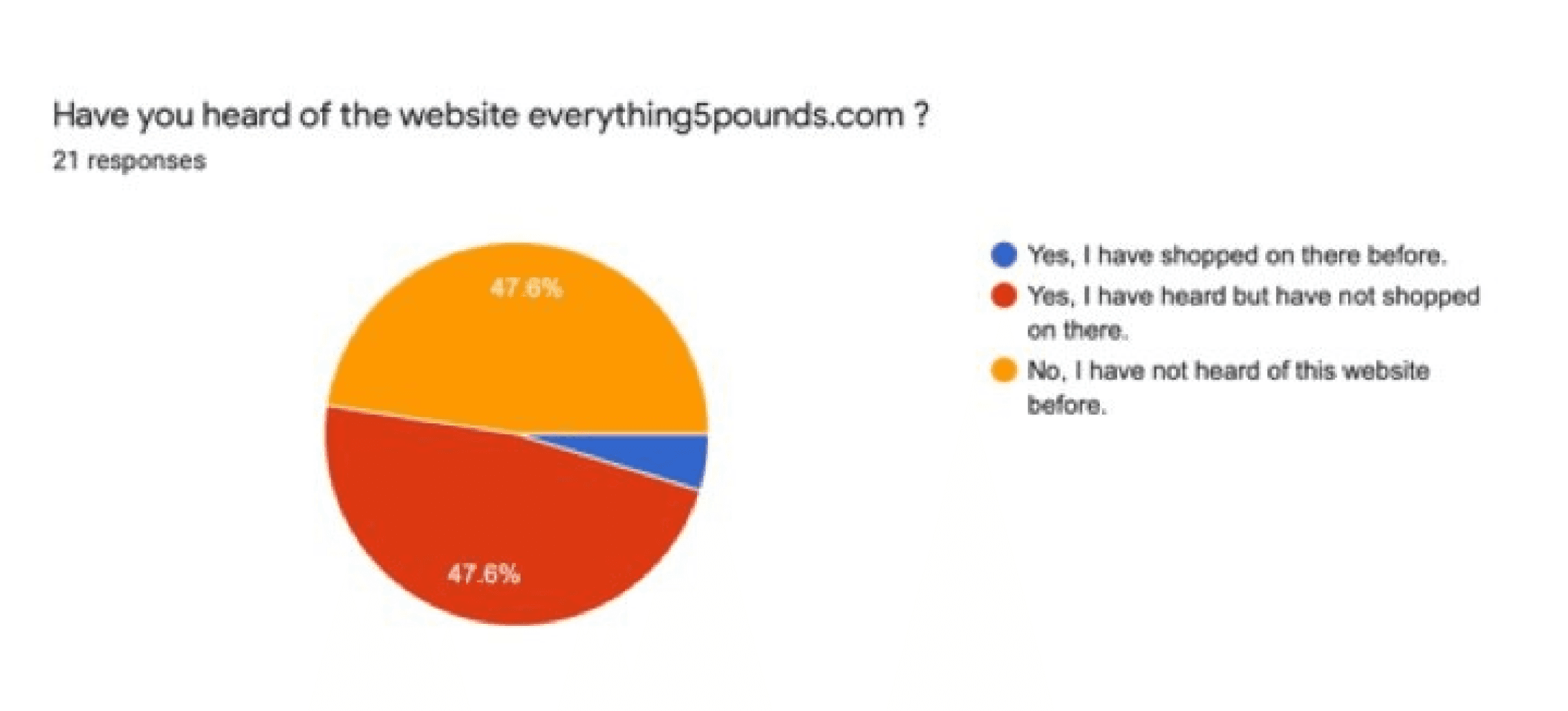
Surveys are a cost-effective method to gather data about users, their opinions, and habits. For this survey, I primarily utilised closed questions, with four optional open-ended questions to allow participants to share their opinions. To mitigate interviewer bias and ensure clarity, I had someone review the questions and used simple, easy-to-understand language. Google Forms was employed to collect the data. Due to time and budget constraints, I recruited 21 participants. However, given more resources, I would have aimed to distribute the survey to multiple demographics over an extended period to obtain a more comprehensive dataset.
71% of participants prefer to shop online.*
100% of participants use the filter option when shopping online.
66.7% of participants prefer to shop using a mobile device.
52.4% of participants mostly shop online for clothing, shoes and accessories.
*Results may be skewed because non-essential shops were closed due to Covid-19 restrictions.
WEBSITE ANALYSIS
To gain valuable insights into the user experience, I conducted a usability test with interviews involving four participants, one male and three females. The interviews were primarily task-based, allowing participants to walk through their actions while enabling me to observe their user journey and identify any potential issues. Follow-up questions were asked to gain a deeper understanding of their experiences. To mitigate interviewer bias, I had my questions reviewed, and to ensure a smooth interview process, I opted to record the screen and audio instead of taking notes, allowing me to fully engage with the participants. This comprehensive approach provided a holistic understanding of the user experience, informing future design decisions.
First Impressions Count
3 out of 4 participants found the homepage uninspiring and lacking in visual appeal, describing it as "bog-standard," "functional but basic," and "utilitarian."
Is it for men too?
One male participant struggled to locate the men's t-shirt category, stating that the "Men's" header/title was not immediately noticeable.
Adding to Wishlists
Two participants expressed frustration with the requirement to create an account before adding items to their wishlist, leading them to open new tabs while browsing.
DEFINE
AFFINITY MAPS
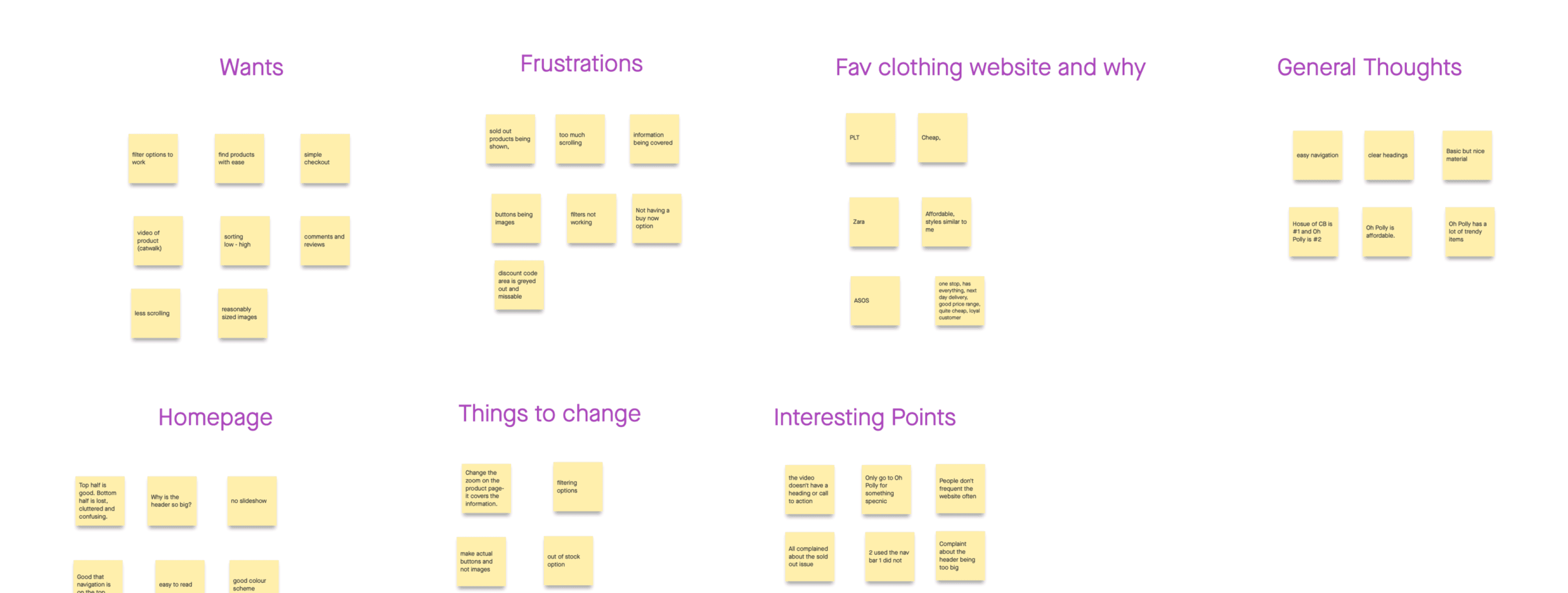
In order to analyse data gathered in the survey and interview, I created an affinity map. Creating this map will allow me to identify key themes, patterns, insights and pain points.
PAIN POINTS
Users find it hard to narrow down search due to lack of filters.
Users are not able to heart/save items without making an account.
Users find the website boring and basic.
Users find that there is a lack of diversity on the homepage (it’s more women focused).
Mobile website has inconsistencies and weirdly placed buttons.
DEVELOP
MIND MAPs & crazy eights
Mind Maps
I concentrated on the pain points and issues that emerged from conducting both primary and secondary research.
It enabled me to identify and explore the underlying challenges, facilitating a deeper understanding of the problem space,
Crazy Eights
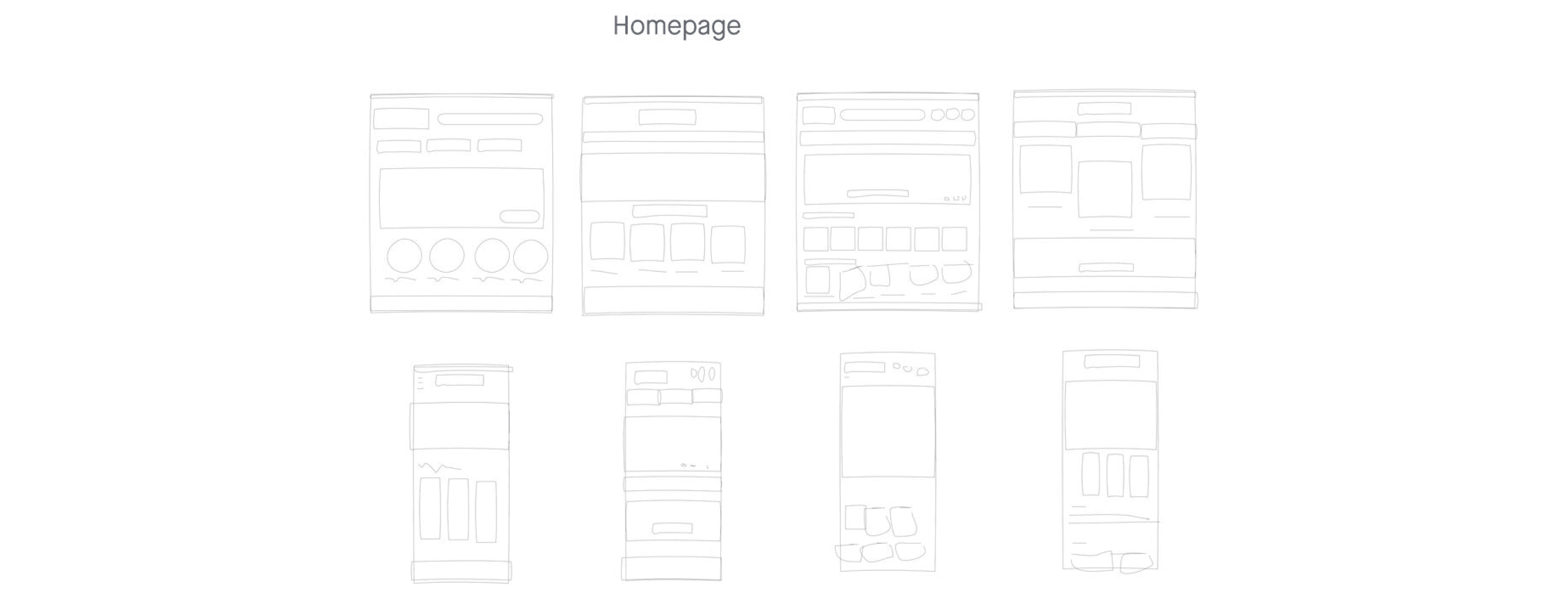
Conducted 3 Crazy Eights sessions based on research data; homepage, category page, product listing
Allowed for visualising and expanding on points from the mind map.
solutions
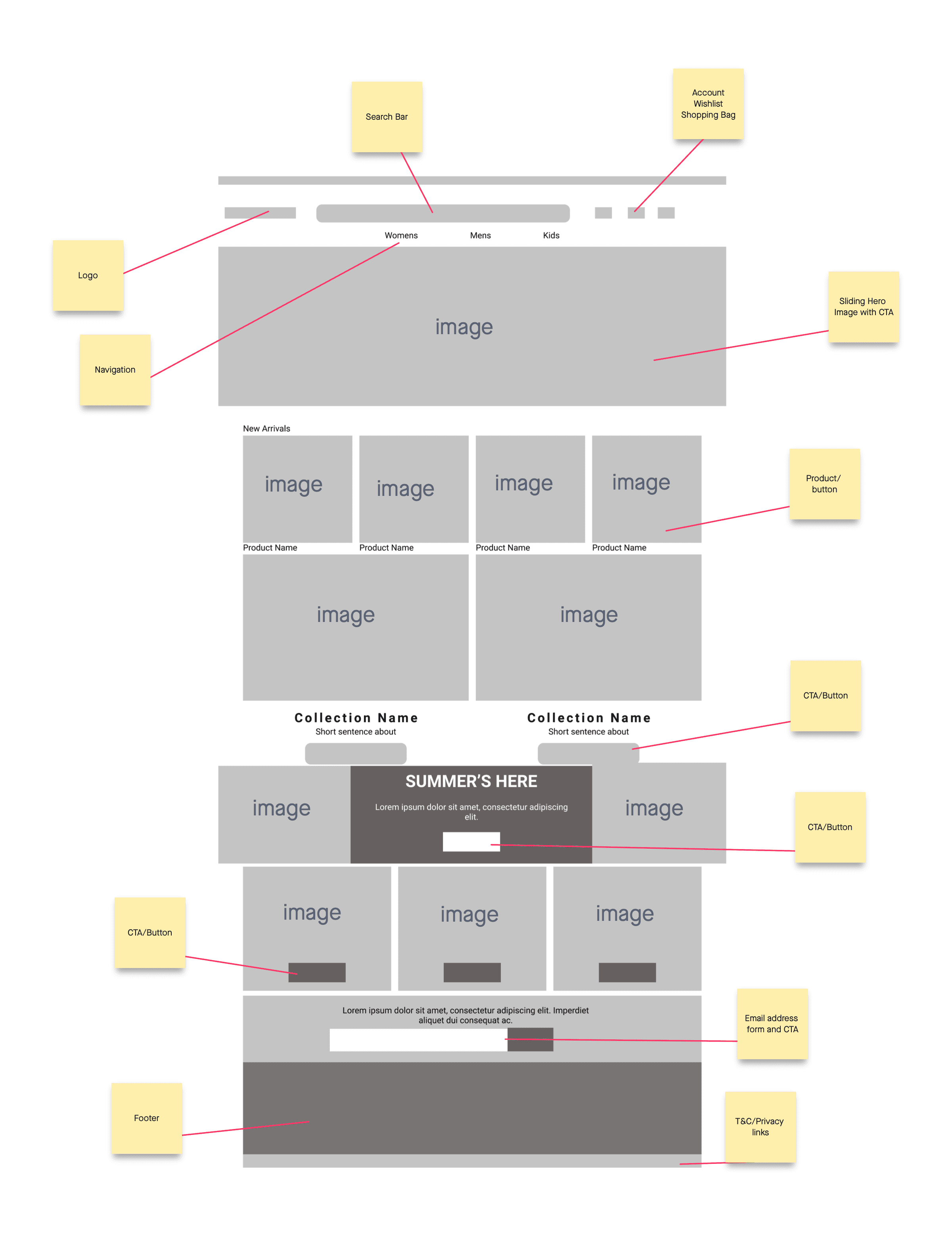
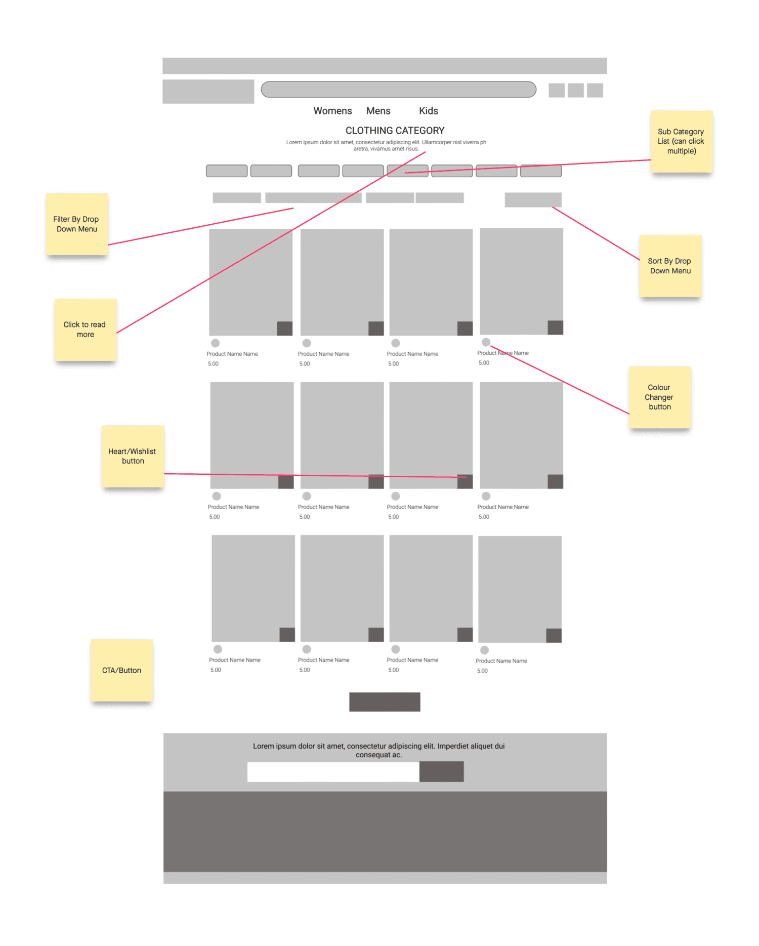
For the low-fidelity wireframes, I selected the best base design from the Crazy Eights and refined it, incorporating components from multiple sketches. The goal was to refresh the website's look while maintaining familiarity for existing customers. Creating low-fidelity wireframes allowed me to visualise my designs and gather feedback before moving to high-fidelity wireframes. I utilised Figma to create these wireframes, exploring different component placements through various iterations.
USER TESTING
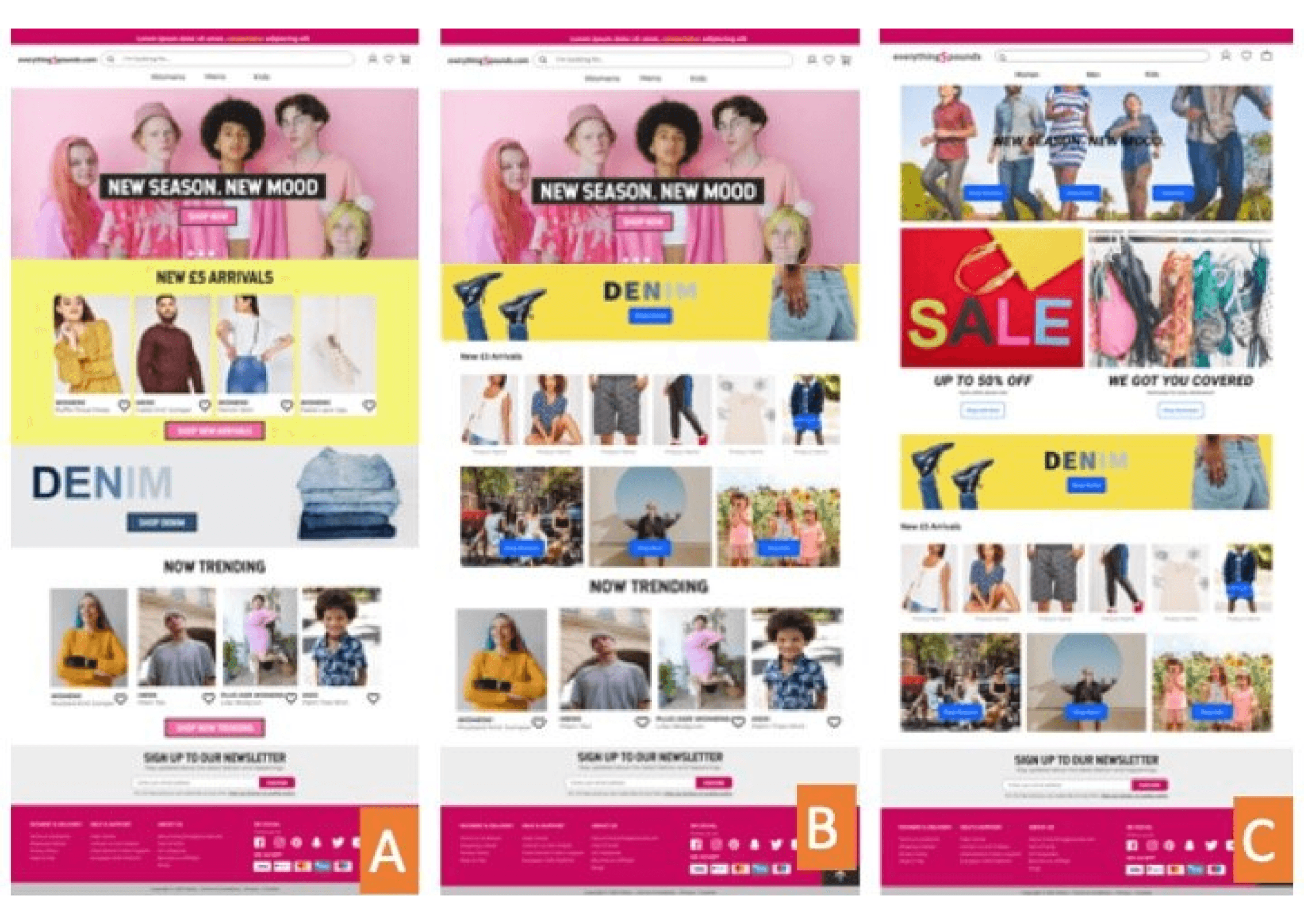
I was uncertain about the optimal design for the homepage, so I created two distinct versions, A and B, along with a third option that combined elements from both. To gather feedback, I presented the high-fidelity wireframes of the homepage to participants and asked them to select the best option. Four participants chose A, citing its clarity, readability, and avoidance of information overload, which was a concern raised with option C. One participant preferred B, while another favoured C. Based on the positive feedback and majority preference for homepage A, I proceeded with that design direction.
DELIVER
hIGH FIDELITY
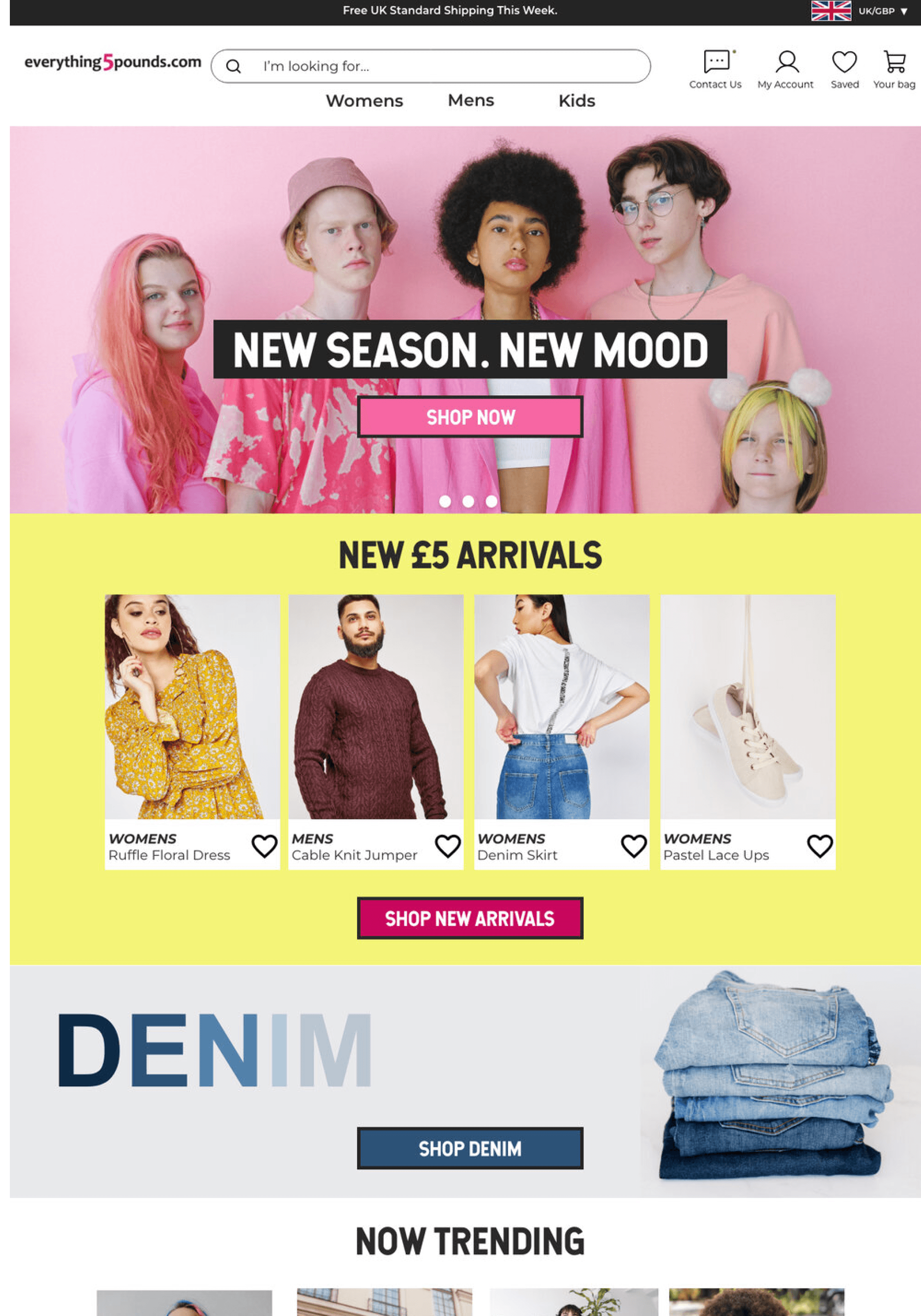
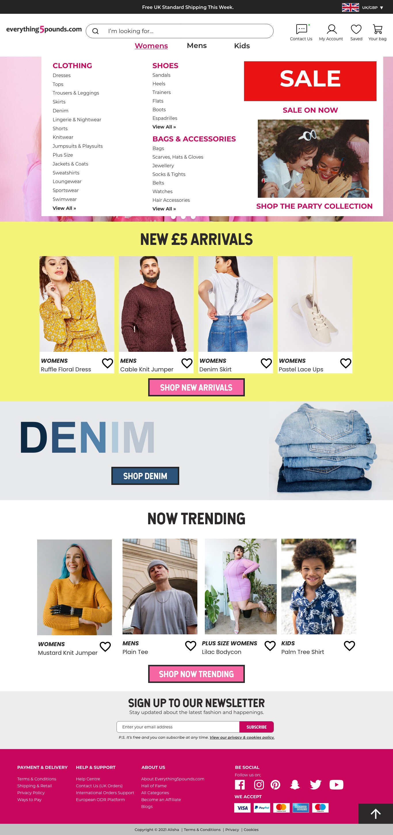
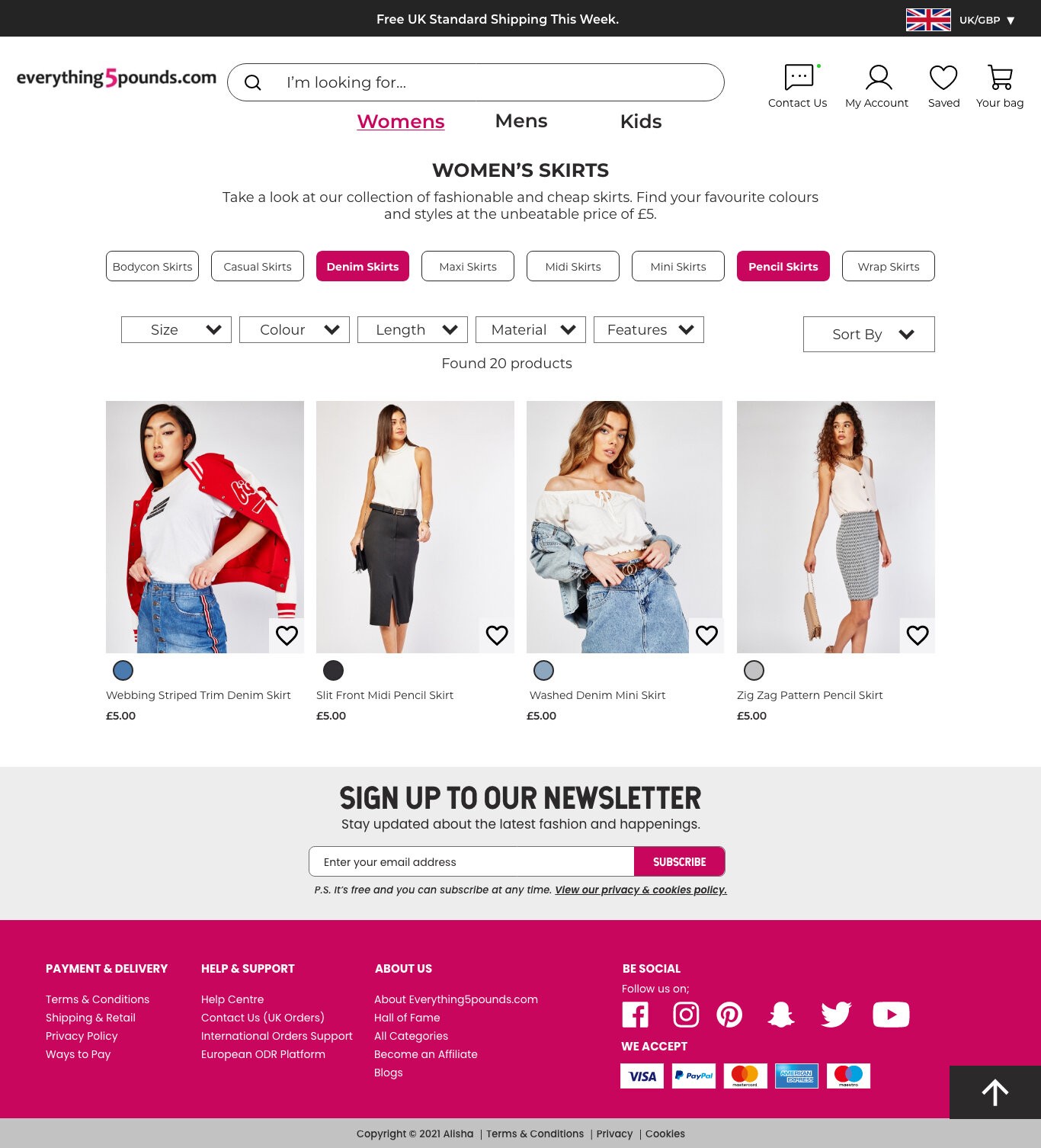
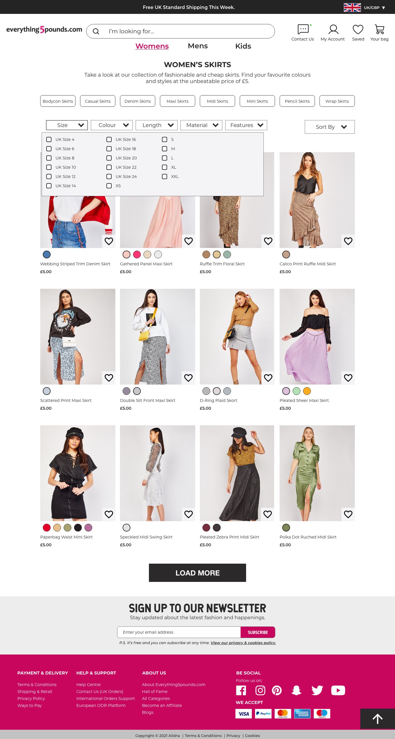
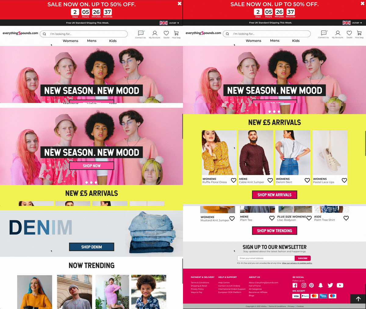
Through numerous iterations and adjustments to the components, I developed high-fidelity wireframes. This process was invaluable as it allowed me to visualise a realistic representation of my designs. Additionally, it enabled me to identify areas for further refinement and improvement. I utilised Figma to create these high-fidelity wireframes, which facilitated gathering accurate and constructive feedback on the designs.
DESIGN SYSTEM
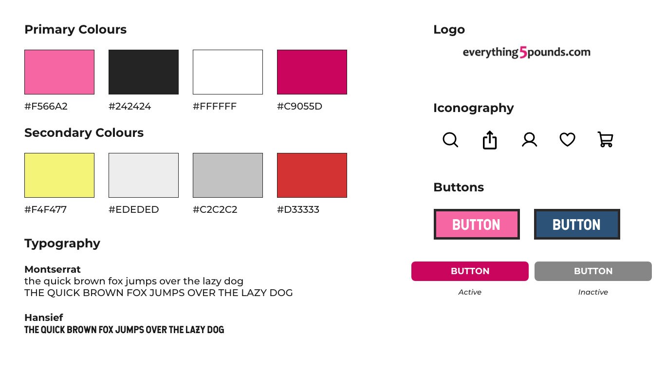
The simple design system showcases the key components of my design. To maintain consistency with Everything5pound's current design system and identity, I retained the colour pink as one of the primary colours. However, I opted for the typeface Montserrat for body text and Hansief for headers, deviating from their current combination of Montserrat for headings and Proxima Nova for body text. This decision was driven by the legibility of Montserrat in both regular and bold weights, its user-friendly nature, and its ability to enhance the website's aesthetic, lending it a modern and visually appealing look and feel.
accessibility (wcag)
Inclusivity and accessibility are paramount considerations in design and website development, ensuring that all individuals, regardless of their abilities or impairments, can effectively engage with the content. To uphold these principles and avoid excluding the disabled community, I adhered to the WCAG through the following measures:
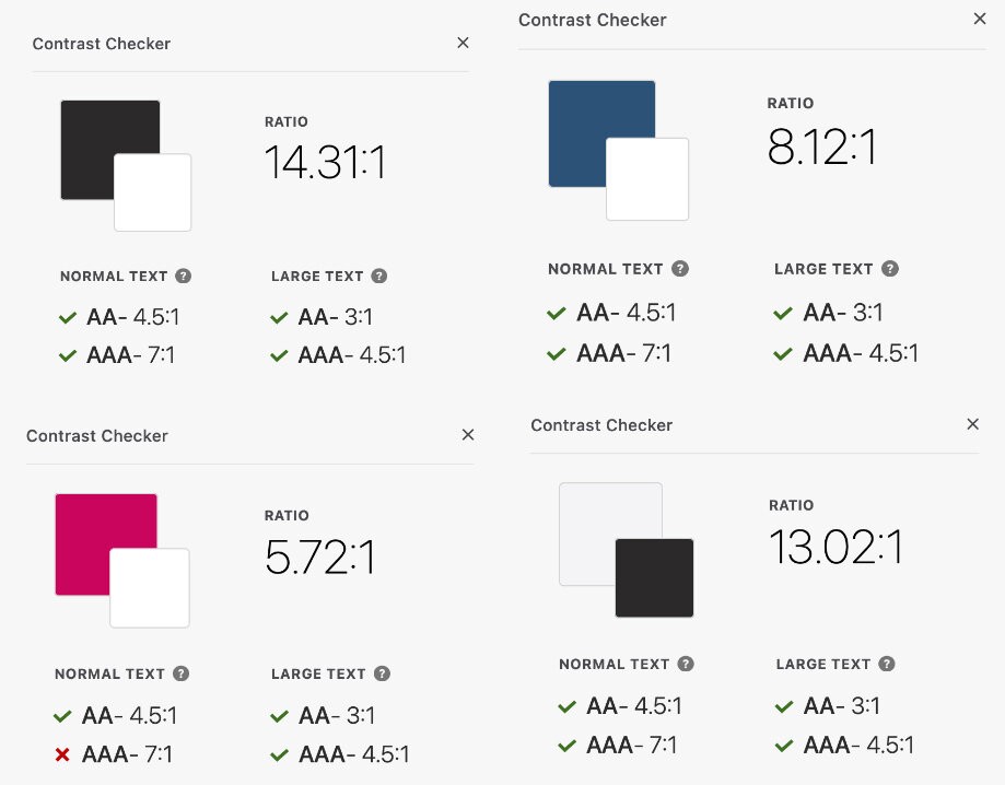
Contrast Compliance: All buttons, pages, and components underwent rigorous contrast testing to ensure optimal legibility by adjusting colour combinations as needed.
WCAG Conformance Level: The design achieved an AA conformance level, which is the recommended mid-range standard for accessibility.
Legible Text Sizing: The smallest text size employed was 12 points, ensuring readability for users with varying visual abilities.
Interactive Element States: Variation states were implemented for buttons on the product page and product category page, providing clear visual feedback for users.
Breadcrumb Navigation: Breadcrumbing was incorporated to enhance the user experience and facilitate seamless navigation through the website's structure.
Clear Information Hierarchy: A well-defined information hierarchy was established, ensuring that content is presented in a logical and easily comprehensible manner.
Accessible Text: All text elements were implemented as actual text, rather than text images, ensuring compatibility with screen readers and other assistive technologies.
By adhering to these WCAG guidelines, the design prioritises inclusivity and accessibility, enabling individuals with diverse abilities to access and interact with the content effectively.
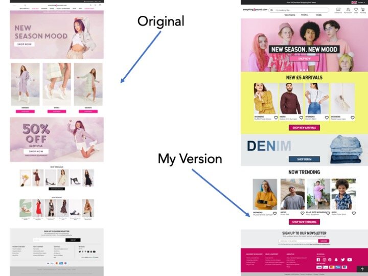
Aesthetic Usability Law
By adhering to the Aesthetic Usability Law, the redesign aims to create a positive perception of usability and strengthen the brand's image through an aesthetically pleasing and inclusive visual design. Here are some examples;
A vibrant and colourful homepage featuring a diverse range of images
Inclusive representation of women's, men's, and children's clothing
Interactive elements that enhance the overall aesthetic appeal
A visually pleasing and engaging user experience
By adhering to the Law of Common Region, the redesign facilitates a more intuitive and user-friendly navigation experience, enabling users to easily identify and access related items within a clearly defined region. Here is how it was implemented;
All women's items, including clothing, shoes, bags, and accessories, were grouped together within a unified section, promoting a cohesive and organised user experience.
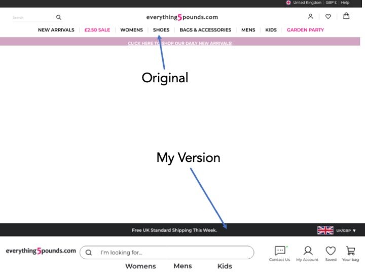
Law of Common Region
Jakob's Law suggests users prefer websites that follow established conventions and patterns they're familiar with.
To align with this principle, the redesign adopts the widely-used e-commerce layout, featuring product images on the left and descriptive text on the right, providing a familiar and intuitive user experience.
By adhering to Jakob's Law and leveraging a commonly recognised layout, the redesign minimises confusion and enhances usability, allowing users to navigate the website effortlessly based on their existing mental models.
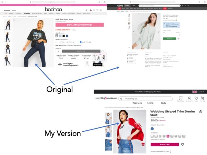
Jakob's Law
CONCLUSION
Conducting this case study was a valuable learning experience, allowing me to apply my knowledge and identify areas for improvement. Due to time constraints, I was unable to conduct extensive user testing on my design, which would have provided insightful feedback on the user experience. While this was my first case study and may not be 'perfect' or 'client-ready,' I am satisfied with the overall outcome, as the primary focus was on learning.
If given the opportunity to revisit this project, I would conduct more comprehensive user research over an extended period. Additionally, I would undertake a complete rebranding of 'five pounds,' including revamping the logo, brand colours, fonts, and imagery to appeal to a broader demographic. Furthermore, I would dedicate more time to refining the designs and potentially incorporating current design trends.
Redesign: Everything 5 Pounds Case Study
